Data Visualization Analysis
AI OR HUMAN?
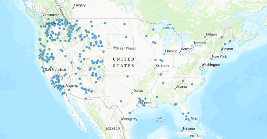
I believe AI, or a similar digital interface, created the above data visualization. The data must be inserted by a person initially, and then it can be updated by the minute. The National Interagency Fire Center collects this data to ensure the accuracy of wildfire incidents in the United States and maintains up-to-date information for the safety of the country’s citizens. The data that feeds the visualization are reports of wildfire outbreaks on a national scale. A map chart is being utilized to display the natural disasters. This design allows observers to clearly distinguish where the wildfires are taking place in the country and stay aware of the weather-related information being researched and reported in the given areas. There does not seem to be any mathematical or statistical models employed in this data visualization, as it adopts a straightforward method of noticing and reporting an incident.
I understand the course structure, grading, and peer-review.